

1
Game Discussion / Let's Discuss: FH's Status
« on: October 19, 2019, 04:06:37 am »
First of all, I just want to clarify that I haven't been active in years (2011-2014, maybe) and thus any drama that has happened recently is completely unbeknownst to me. Nonetheless, it doesn't take a highly active player to see the issues of FH and the things that need to be modified.
From my understanding, the site and the game are already on the right track to being improved, but there are still numerous problems with the game, the website, and the forum. I'm going to go into detail on these issues and give my input.
It's also important to keep in mind that this discussion is not to offend, insult, or discredit anybody. Game development and programming is hard—I respect that and the work that is done.
As everyone knows, FH hasn't been updated in several years due to the developers not having access to the source code. However, that has been very recently changed, and with a new programmer on board, the future updates are an exciting wait. But what needs to be changed, exactly? What features need to be implemented, removed, or modified to make FH into the animal MMORPG it deserves to be? Read below, young floofs.
The UI (& Related)
I've had problems with the UI ever since I started playing FH. It's clunky, ugly, and incredibly outdated. There needs to be a serious update on the UI, and not just in terms of functionality. We've had the same old look for literally years, and if the developers plan on improving the game, this is one of the first things that needs to be improved.
For starters, the chatbox is huge and annoying. There's no harm in cutting the width of it down a few notches, but even then it's still in the way. Why not implement a feature where the chatbox itself turns invisible when not in use? The text can still be read, and if there's an issue with the text color, why not implement a feature where users can change the text to their own desired color? This is something that is easily fixable and would make the game's UI so much cleaner and less cluttered. I've seen it in multiple MMOs and it's never been an issue.
Secondly, the buttons. The buttons are great if you're a girl or boy scout, but not so much for an MMO. Small, transparent icons would be significantly better and would free up so much space for players. A lot of popular MMO's have these icons typically on the bottom right, which I think would make the game look and feel a lot better. If the placement of the map, chatbox, and generic UI features is an inconvenience to some players, why not enable a feature where these can easily be moved around on the screen? Once again this is another simple and fixable feature. Little features and changes do count, especially for a game that hasn't been significantly updated in years.
Thirdly, the controls. The default controls are very weird. I mean, holding down on the scroll button to zoom out? What? That's incredibly bizarre. Why not implement a basic, well-known key control layout? You can find examples of this everywhere, even on games that aren't MMOs. Better yet, why not add in the ability to change the keys for the controls? That would be so, so much better and customizable for all players.
The Models
I'm not going to discuss the base animations here because I already know that there is a search to improve the animations, but I have yet to see anything regarding the models. The models aren't the worse, but they can be improved. They have some aspects of them that are very jagged, such as the ears and tails. These features need to be smoothed down and tweaked.
Not only that, but the models seem incredibly sharp. This isn't necessarily a bad thing, but there's not much roundness to the models, especially in places where there needs to be. The nose, mouth, back of the legs, and underneath the chin are a great example of this.
Another thing that irks me is how the ears and the tail have such a prominent seam. This should be smoothed out so that the ears and tail look like a part of the model instead of a magnetic clip-on.
The above also applies to the objects that are in the game.
Content
Much of what I'm going to list here has probably already been repeated multiple times, but I have a voice and I'm going to use it, so here goes nothing.
Character Customization
Maps & Scenery
Animations
Other
God, where do I begin with this? The website and forum have barely been updated since its inception.
The Website
When I'm playing a game like FH, I want to see life and activity bursting on the screen. I want to feel like you're stepping into a world of fantasy, and perhaps even an escape from my own reality... FH's website does not do that for me. Images speak louder than words, so I'm going to provide some images that I think would give a good idea as to what needs to be modified.

This is just a rough layout, but it gives a general idea of the idea I'm trying to convey. Why should the news exclusively go into the forum or the game? It's the most exciting information out there! Let's put that on the side in a scroll box.
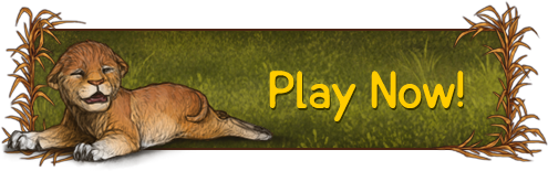
Downloading playing the game is the most important aspect, but why is that in such small text just scattered across the screen? Slap on a banner! There could even be a banner that's decorated with flowers, leaves, etc. depending on the theme that we're going for. Lioden's home page is a great example of this:
In the white space on the bottom left there can the "users online text", or even in the "login" and "register box". As for the "mascot box", there could be a slideshow of screenshots from the game or just artwork in general. This would bring so much life to FH's website and would be inviting to new players and old, returning players alike.
The Forum
I don't think I've ever seen a forum so dark and gloomy. I'm going to list below what needs to be changed.
This post is getting pretty long, so I'm going to end it here. I hope this provides some insight and is useful. If you have any additional ideas, please do comment on them below! I worked very hard to compile this post and hope it has some impact.
From my understanding, the site and the game are already on the right track to being improved, but there are still numerous problems with the game, the website, and the forum. I'm going to go into detail on these issues and give my input.
It's also important to keep in mind that this discussion is not to offend, insult, or discredit anybody. Game development and programming is hard—I respect that and the work that is done.
The Game
As everyone knows, FH hasn't been updated in several years due to the developers not having access to the source code. However, that has been very recently changed, and with a new programmer on board, the future updates are an exciting wait. But what needs to be changed, exactly? What features need to be implemented, removed, or modified to make FH into the animal MMORPG it deserves to be? Read below, young floofs.
The UI (& Related)
I've had problems with the UI ever since I started playing FH. It's clunky, ugly, and incredibly outdated. There needs to be a serious update on the UI, and not just in terms of functionality. We've had the same old look for literally years, and if the developers plan on improving the game, this is one of the first things that needs to be improved.
For starters, the chatbox is huge and annoying. There's no harm in cutting the width of it down a few notches, but even then it's still in the way. Why not implement a feature where the chatbox itself turns invisible when not in use? The text can still be read, and if there's an issue with the text color, why not implement a feature where users can change the text to their own desired color? This is something that is easily fixable and would make the game's UI so much cleaner and less cluttered. I've seen it in multiple MMOs and it's never been an issue.
Secondly, the buttons. The buttons are great if you're a girl or boy scout, but not so much for an MMO. Small, transparent icons would be significantly better and would free up so much space for players. A lot of popular MMO's have these icons typically on the bottom right, which I think would make the game look and feel a lot better. If the placement of the map, chatbox, and generic UI features is an inconvenience to some players, why not enable a feature where these can easily be moved around on the screen? Once again this is another simple and fixable feature. Little features and changes do count, especially for a game that hasn't been significantly updated in years.
Thirdly, the controls. The default controls are very weird. I mean, holding down on the scroll button to zoom out? What? That's incredibly bizarre. Why not implement a basic, well-known key control layout? You can find examples of this everywhere, even on games that aren't MMOs. Better yet, why not add in the ability to change the keys for the controls? That would be so, so much better and customizable for all players.
The Models
I'm not going to discuss the base animations here because I already know that there is a search to improve the animations, but I have yet to see anything regarding the models. The models aren't the worse, but they can be improved. They have some aspects of them that are very jagged, such as the ears and tails. These features need to be smoothed down and tweaked.
Not only that, but the models seem incredibly sharp. This isn't necessarily a bad thing, but there's not much roundness to the models, especially in places where there needs to be. The nose, mouth, back of the legs, and underneath the chin are a great example of this.
Another thing that irks me is how the ears and the tail have such a prominent seam. This should be smoothed out so that the ears and tail look like a part of the model instead of a magnetic clip-on.
The above also applies to the objects that are in the game.
Content
Much of what I'm going to list here has probably already been repeated multiple times, but I have a voice and I'm going to use it, so here goes nothing.
Character Customization
- New eye shapes and pupils.
- The ability to add multiple markings with different colors.
- New marking options.
- New ear and tail shapes.
- The ability to add, remove, and lengthen claws.
- New tongue shapes. For instance, a forked tongue.
- New howling and roaring noises.
- New wing types.
- The ability to add scars and other abrasions.
- The ability to lengthen teeth length and add chipped or broken teeth.
- A more pronounced body type slider. For instance, the ability to make your character very fat or very emaciated.
- The ability to increase nose size.
- A randomizer for those lacking inspiration.
- The ability to add horns.
Maps & Scenery
- New and advanced foliage.
- New and advanced trees.
- Improved water.
- Animal NPCs, such as rabbits, birds, butterflies, and fish that occupy the maps. It would be interesting to see the animals change with the time of day, such as owls and croaking frogs at night and birds chirping in the early morning.
- Underwater scenery.
Animations
- The ability for felines to scratch and climb trees.
- The ability for canines to dig holes.
- Ground sniffing animations.
- Drinking and eating animations.
- Idle animations, such as ear flicking, nonchalantly sniffing the air, etc.
- Grooming animations.
- Panting after excess running.
- Growling and snarling animations with noises.
- The ability to howl while sitting and laying.
Other
- New splashscreens and tips.
- Improved, quality artwork in general.
The Website & Forum
God, where do I begin with this? The website and forum have barely been updated since its inception.
The Website
When I'm playing a game like FH, I want to see life and activity bursting on the screen. I want to feel like you're stepping into a world of fantasy, and perhaps even an escape from my own reality... FH's website does not do that for me. Images speak louder than words, so I'm going to provide some images that I think would give a good idea as to what needs to be modified.
This is just a rough layout, but it gives a general idea of the idea I'm trying to convey. Why should the news exclusively go into the forum or the game? It's the most exciting information out there! Let's put that on the side in a scroll box.
Downloading playing the game is the most important aspect, but why is that in such small text just scattered across the screen? Slap on a banner! There could even be a banner that's decorated with flowers, leaves, etc. depending on the theme that we're going for. Lioden's home page is a great example of this:
In the white space on the bottom left there can the "users online text", or even in the "login" and "register box". As for the "mascot box", there could be a slideshow of screenshots from the game or just artwork in general. This would bring so much life to FH's website and would be inviting to new players and old, returning players alike.
The Forum
I don't think I've ever seen a forum so dark and gloomy. I'm going to list below what needs to be changed.
- The colors need to be lightened significantly, or even changed completely.
- Many, many aspects of the forum needs to be aligned. Why are there so many jagged edges? Let's get things aligned!
- The text needs to be larger, especially for the menu bar.
- Why are there so many random yellow dots all over the text? That needs to be removed
- Instead of having the text "FeralHeart" at the top left, why not replace it with a drawn logo or image to give the forum some more life?
- Why are there so many random text boxes and borders? Some of those need to be removed to make the site look cleaner.
- The "simplemachine forums" text at the top right is very unsightly. Is there a way to remove that? If so, it should be removed.
- The profile information and text on the top left needs to be pushed to the center more.
- There's so much blank space, especially for the middle of the top bar. Why not add a slideshow of screenshots or images? Even a regular banner would look better.
This post is getting pretty long, so I'm going to end it here. I hope this provides some insight and is useful. If you have any additional ideas, please do comment on them below! I worked very hard to compile this post and hope it has some impact.