to be honest I think the character creation screen should be rehauled entirely or switched back to the way it once looked, the new look with the plain white is pretty blinding and just... doesn't really look right at all in my opinion and it looks so different from the quality of the rest of the game.
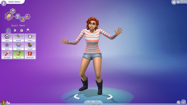
if they really want to remove a mapped background for 'more focus on the character', i think they should go for more of a sims 4 route, like this: